

Client: SunBathers
Industry: Plant Nursery and Breeding
Location: New South Wales, Sydney, Australia
Scope: Logo Design and Packaging
Year: 2022
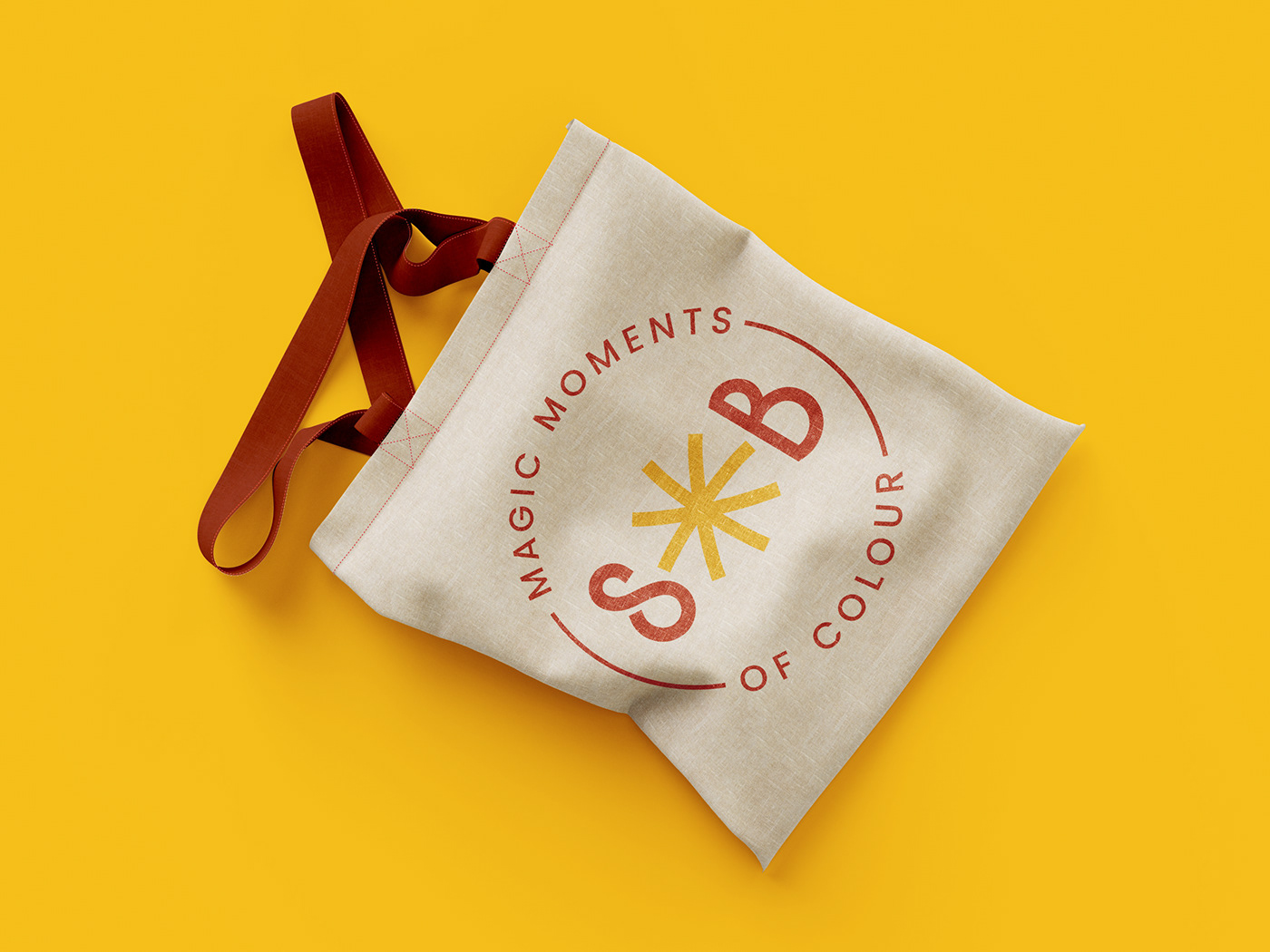
Magic Moments of Colour — That's what was necessary to be reflected.
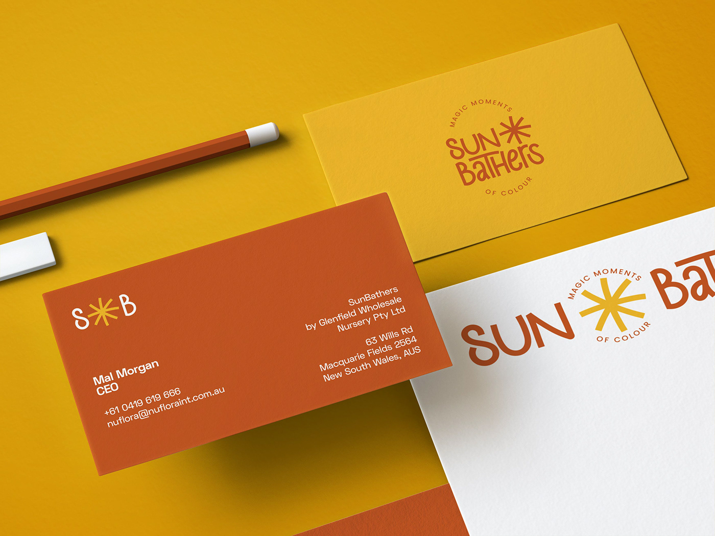
SunBathers® (by Glenfield Wholesale Nursery) is a New South Wales based (Sydney, Australia) plant breeding and nursery brand, run by the global visioned and impact-driven founder Mal Morgan.
When Mr. Morgan let me step in to solve his branding problem, we immediately pointed out a specific area to improve together: #Simplicity.
Great logos are generally the simplest ones, because they are memorable, easy to distinguish, and timeless. Our job as brand designers should not be to create the most storyteller logo, but to create the one that avoid complexity as much as possible.
Goals and Style Direction
When we kick off the project, a couple of deep discovery sessions on what the goals were, who the audience was, and what kind of a personality the brand would have was undergone.
As the company would champion the quality of products and caregiver service, the brand had to catch it up to be memorable and standout.
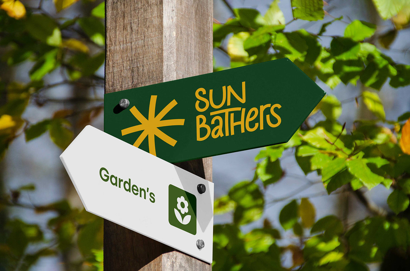
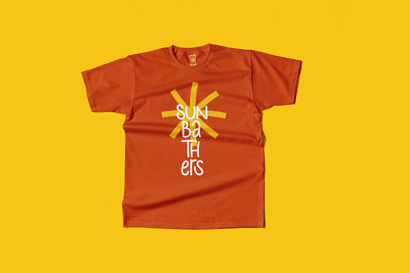
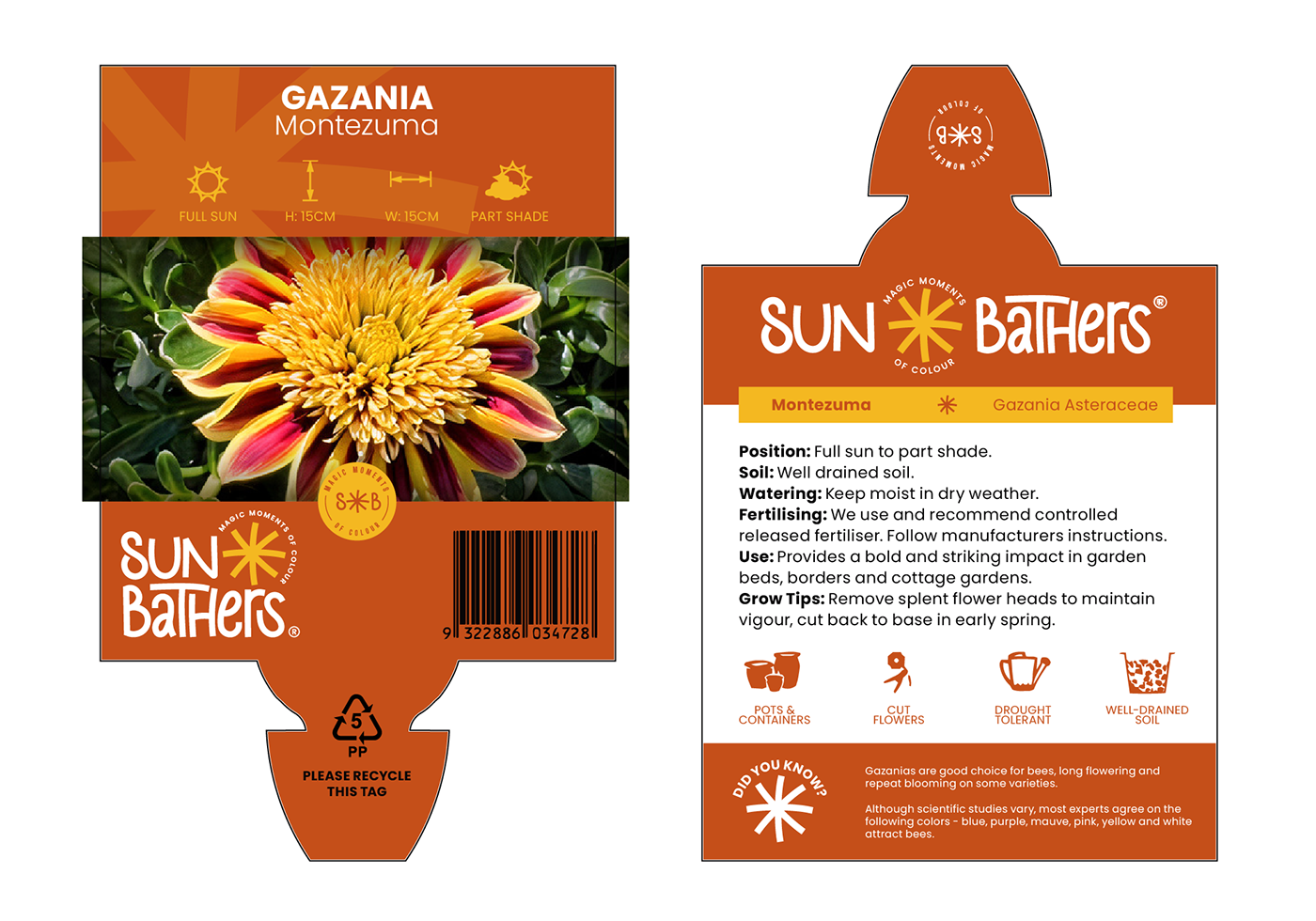
In those sessions, we ended up with the idea to create an enjoyable brand. Since the product is flowers and plants that make hobby gardens and landscapes more beautiful, the end-user would enjoy and have fun growing them. Mostly the gazanias and likewise colorful ground covers are the products to be packaged well and shipped. When they had a look at the package, they should have feel that energetic and happy vibration.
After the new logo design got approved, it also needed to be applied to the new packaging (see at the end).
In this journey of (re)branding, you are about to follow one of the most joyful projects I've done this year.


Above: A screenshot from the logo pitch. Keywords are from the initial discovery sessions.
Moodboards
Below: Three moodboards with different vibes that I created to check with the client.
Their choice was the first one; the more playful and cheerful direction.


Logo Design — Concept Development
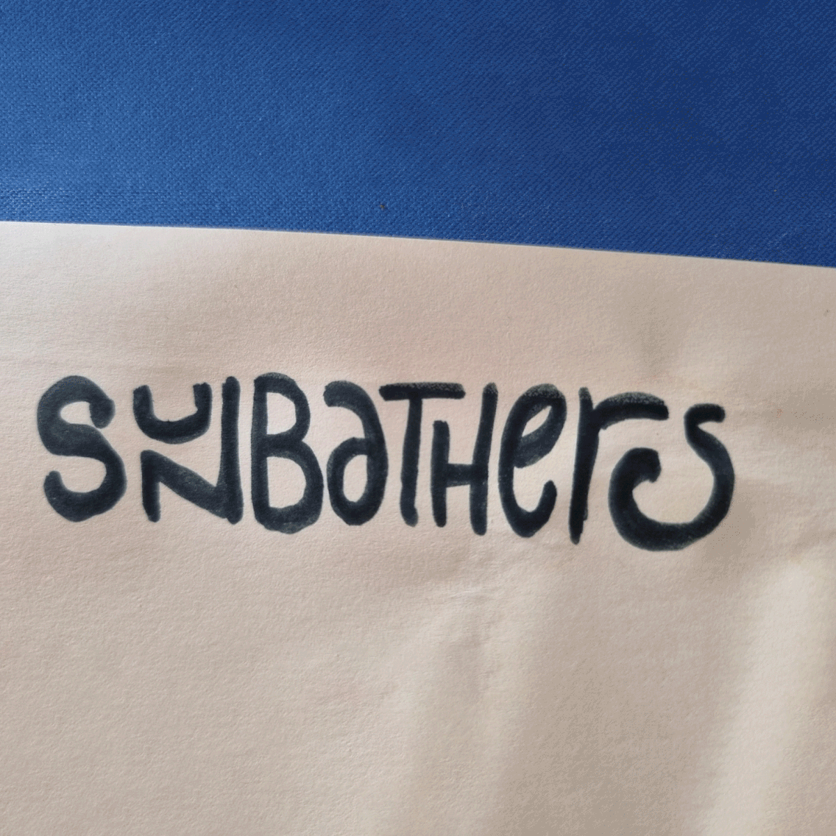
From quick sketches of exploration, to the refined direction we chose.
It had to be a little quirky yet legible, playful yet bold, simple yet unique.
After a week of sketching, four logo options came up (see below), and the client has chosen the first one.
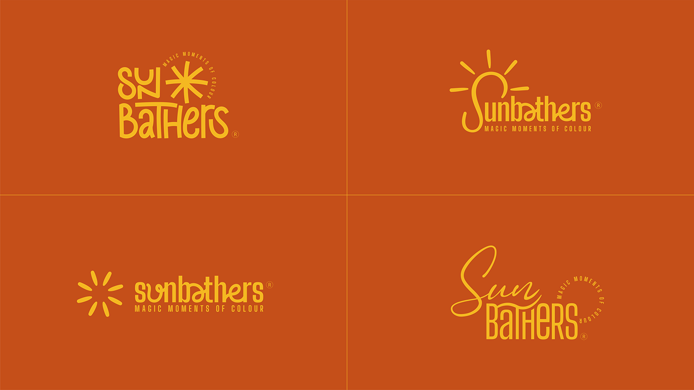
(Above) The logo evolution on the exploration phase.
Logo Design — Concept Evolution and Refinement
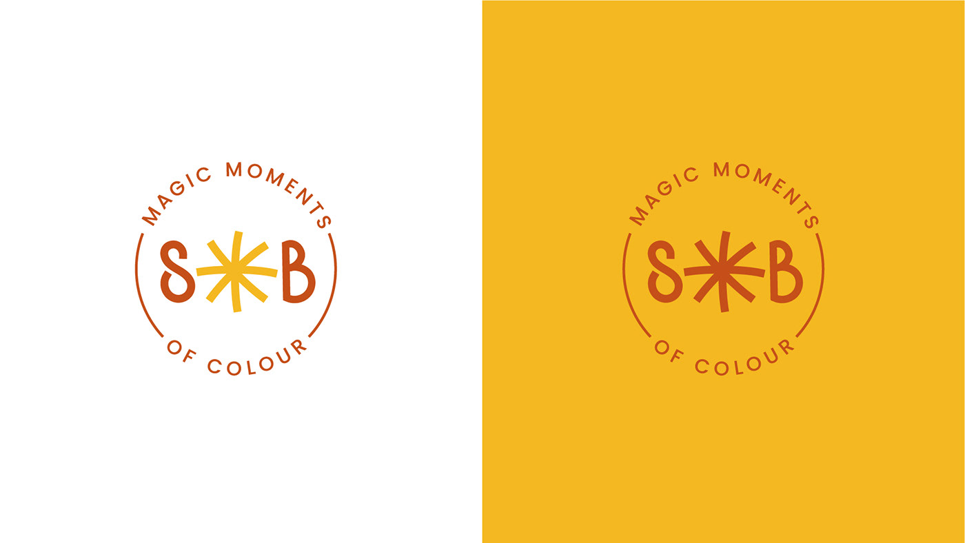
The approved logo of SunBathers® has evolved from a design that I created at one step earlier. That design, though I consider it was a bit more unique, had issues with legibility of the word "SUN". To address my client's concerns, the approved logo got further improvement and has become the final design (see below).
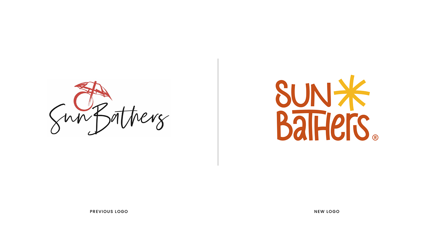
(Above) The previous logo was OK, but not great. First, it was too light to stand out; second, it had too much details within its wordmark and illustration, which would cause failure on legibility when used for the small areas. Also, the color combination of dark red and black definitely did not help the brand to reflect its joyful characteristics.
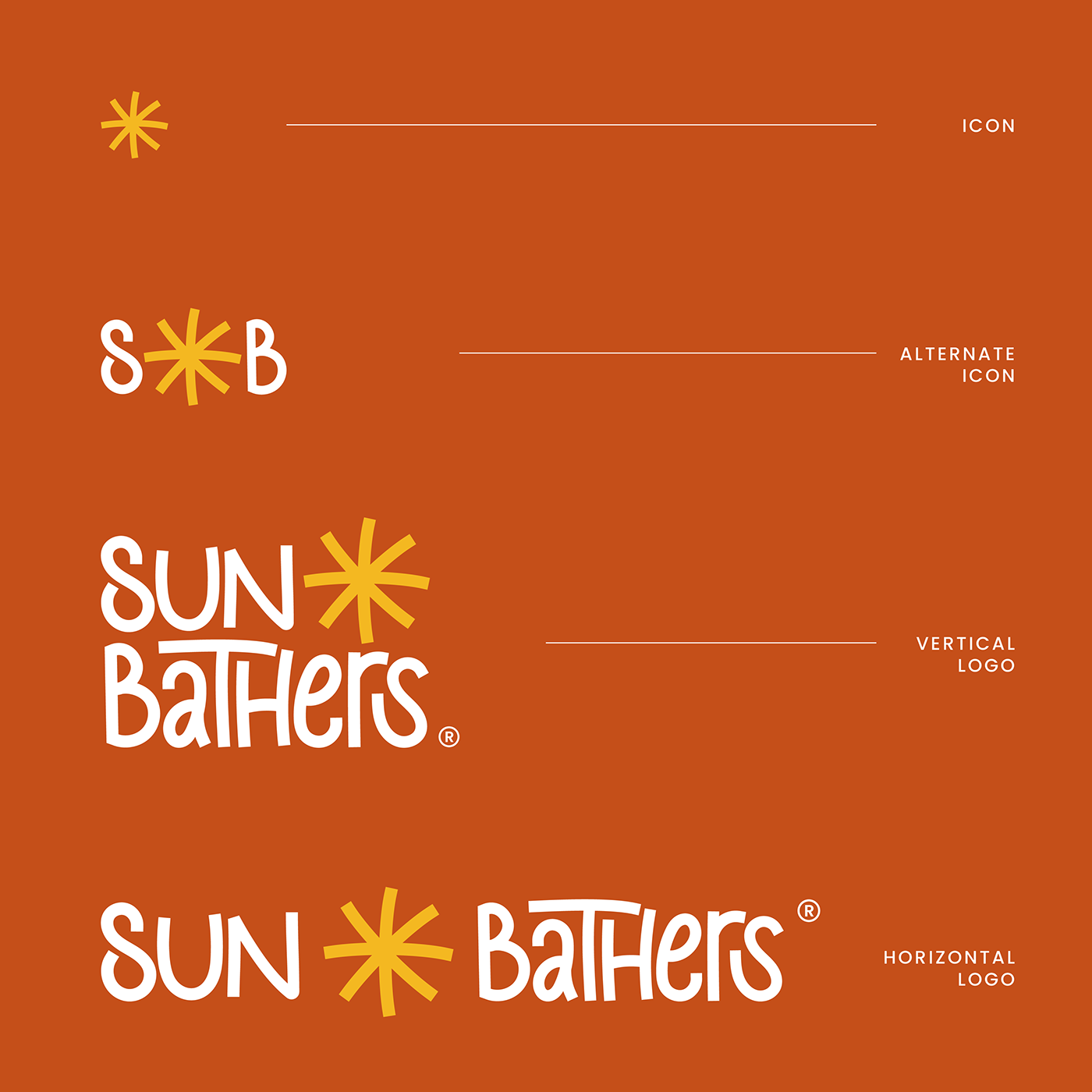
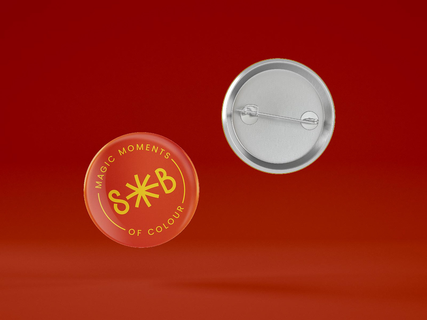
(Above) Logo suite variables.
It's not the case anymore to have only one layout for the logo.
Instead, a modular system is needed for different media and different sizes of use.


(Above) The approved logo of SunBathers® has evolved from a design that I created at one step earlier.
That first design, though I consider it was a bit more unique, had issues with legibility of the word "SUN". To address my client's concerns, the approved logo got further improvement and has become the final design.


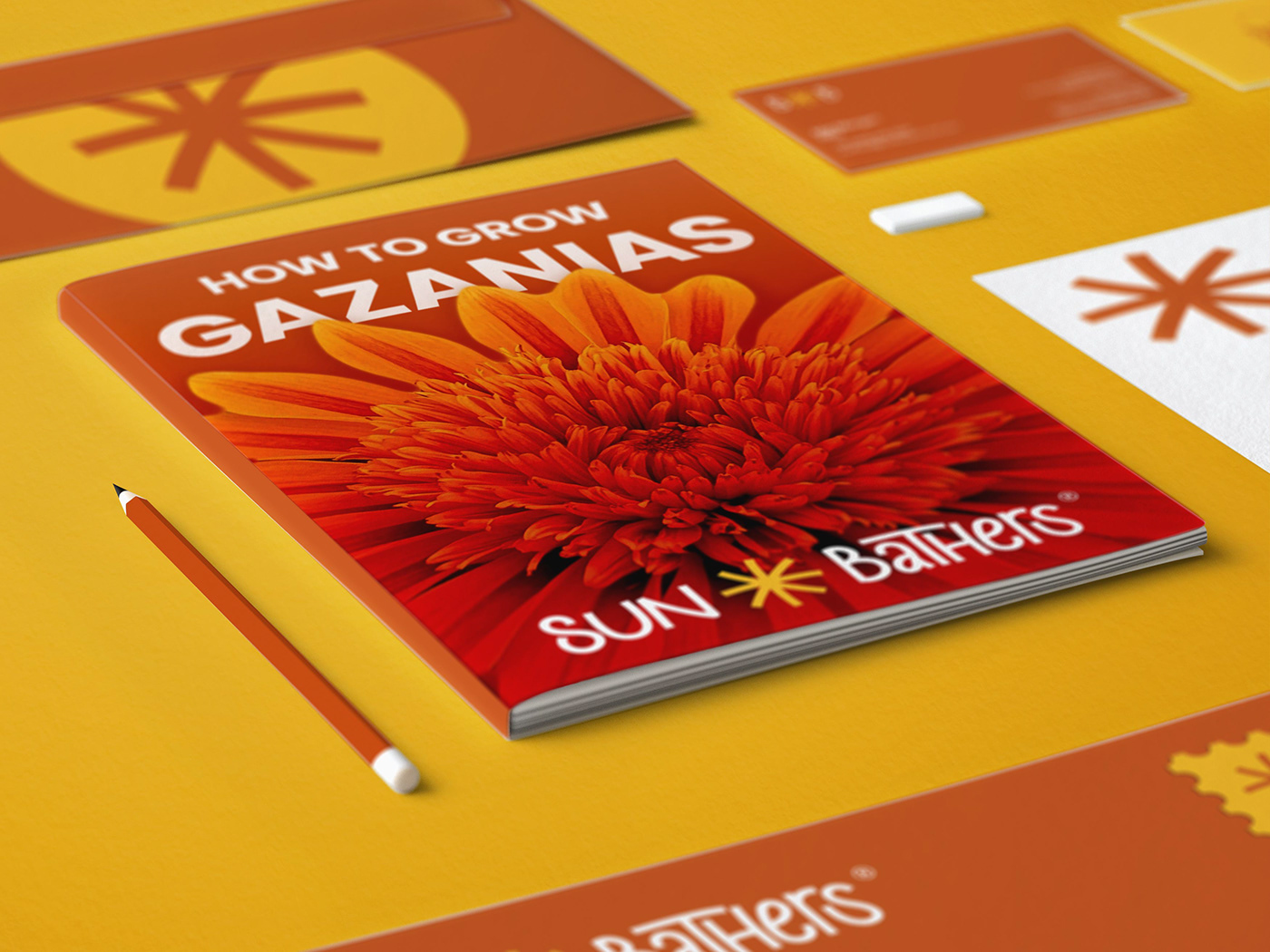
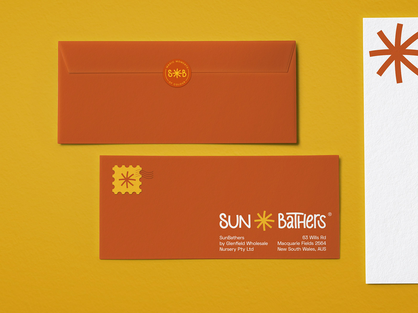

Packaging Design


Thanks for watching!
Did you like this?
—
For collaboration inquiries
and my other branding works,
be a guest on: itsdace.com


